Ichishima Brand Identity Design Concept
市島酒造ブランディング デザインコンセプト
We thought it important to see what could be done to distinguish Ichishima brewery from other breweries in Japan while still preserving some of the underlying aspects of classic Japanese sake label design. Sake in Japan also has deep historical resonances with Shintoism and we felt it critical to keep this particular animistic element clearly forefront in the design.
The allusion to water is key to this design because it is the local water of Niigata that differentiates Ichishima sake from other sakes in Japan. The snow melt water contains fewer minerals which results in a longer fermentation process and an end result that is more refined, sophisticated and subtle than sakes from other regions.
Given the distinguishing features noted above, we decided that the bulk of the current styles in use today, featuring for example bold calligraphy, were not appropriate. On the other hand, the design had to evoke a deep historical resonance with both Japanese design and with an even older archaic Japanese spirit linked to the land and the forces of nature. This design evolved out of these considerations.
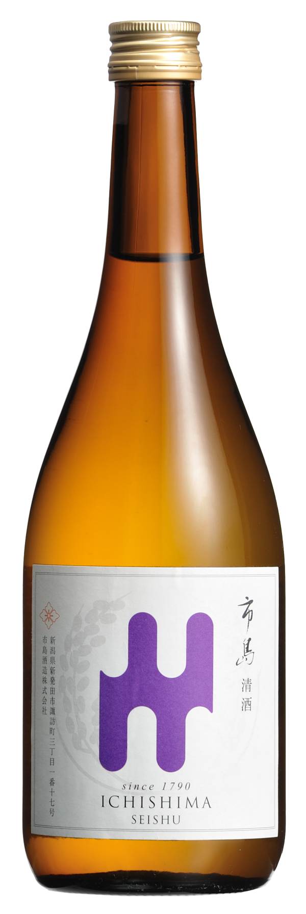
The principal element of the design directly denotes the falling or dripping of water, part of the process of making sake. It also refers to how sake itself adheres to the side of the glass when being drunk. A further water reference is in the image of multiple streams separating and joining while flowing down from a mountain source.
市島酒造を国際ブランドとしてデザイン化するにあたって、清酒ラベルが持つ古典的デザイン要素を新しいラベルに保持しつつ、市島の清酒が他の地域の酒蔵のものと比較してどのように優れているのか、またその差異をどのように視覚的に訴えるべきかを見極めることがとても重要だと考えました。清酒は歴史的に神道と深く関係しているところから、神道が持つ自然崇拝、精霊を尊ぶ要素を視覚的に明確に表現するべきであると感じました。(事実、その昔、市島酒造の酒蔵は諏訪神社の敷地内にありました。現在は互いに隣接しています。)
水の流れや雫を暗示させるもの、それが今回のデザインのポイントです。なぜなら新潟の水が市島の酒と他の地域の酒との質の違いを作る一つの大きな要素だからです。ミネラル分の少ない軟質の雪解け水は発酵過程に時間がかかり、そのため、洗練され上品で繊細な清酒をつくりだします。
そのような明確な特徴を与えられたことで、現在の清酒市場において広範囲に使われているボトルラベル上の書道的な筆の表現を使用する代わりに、日本デザイン史の奥深さと大地と自然の力がリンクされたより古い時代のそのまた昔の精神を思い起こさせるようなものにしたいと考えました。
このデザインはそれらを考察して展開させたものです。 このデザインの基本的な要素は清酒作りの工程における流れ落ちる水、水滴を表現したものです。また、酒を注ぐときに器やガラス面に残る雫の形を意匠化したもので、さらにもう一歩進めると山から湧き出る水が分かれまた繋がっていく状態を形象化したものでもあります。